Just in Time for Spring, the Lab Gets a New Logo
By Mary Guthrie, Cornell Lab Marketing Director
March 25, 2009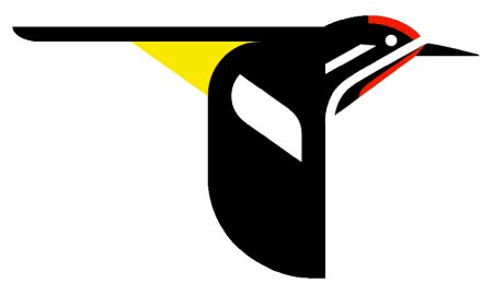

This past week was big for us for a couple of reasons. There’s the new look to All About Birds, and if you look at the top of each of those pages you’ll notice the debut of our new logo, based on a colorful sapsucker. We chose this bird as a reminder of where we come from: the beautiful 220-acre Sapsucker Woods sanctuary that’s the home of the Lab of Ornithology, just outside Ithaca, New York. You’ll see even more of the sapsucker as we integrate it into our print and Web publications in the coming months.
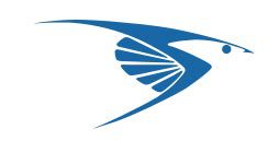

We’re still fond of our blue “everybird” logo – and many of you probably are, too. It has accompanied our name for nearly 40 years, acquired more than a few nicknames, and inspired plenty of discussion about what bird it most resembles (popular responses include Peregrine Falcon and Tree Swallow, among others).
But the Lab is a whole different place now than we were when that logo was designed. Back then, our staff numbered only about two dozen. Our logo stood tall and used all capital letters to demonstrate we were serious about birds. Today, with more than 260 employees, programs that reach around the globe, and projects that include everyone from academic leaders to beginning citizen scientists, we felt it was time for an update.
Today’s Lab is an academic institution – scientific research is our bread and butter. But we also have a long history of partnering with people who love birds and who help us learn more through citizen science. We are also a resource for hundreds of thousands of people who use our materials to help them enjoy birds. We’re not just a “laboratory,” at least not in the typical sense of a room staffed by people in white coats who sequence DNA. We’ve got that kind of science, but we are also much more. How do we communicate our serious research side and be seen as a welcoming collaborator at the same time?
We asked that question of logo design expert Michael Bierut, of Pentagram Design. Bierut spent time with us, listened to many people who work here, in all types of jobs, and came back with a design inspired by the work of artist Charley Harper. Harper had a long association with the Lab, and many of his original works hang in our building. The look is simple, graphic, and modern. The word “Cornell” is in boldface to emphasize our connection to a great research university. Our two typefaces (Avenir and Mercury) have a modern, friendly look but one that is based in tradition. The colors are bright, and that bird is on a mission!

Over the coming year we will phase out the everybird, and you’ll see more and more of the sapsucker. We’re moving forward with the hopefulness that we can inspire more people to participate in our programs and to think about conserving the birds we all love. Thanks for being a part of that.


All About Birds is a free resource
Available for everyone,
funded by donors like you


